Web Design Tools
Web Site Tools > Design • Creation • Promotion


Designing A Website
Website design can mean the difference between lots of visitors, or none at all. Many people confuse great website design with flashy graphics or catchy music. In fact, when it comes to whether a website is frequently used, accessibility and quality of information rank highest on the list. In other words, form must be married to function. The best websites are equally aesthetically pleasing and well planned.
Website Architecture
At its core, a good website must have an architecture that structures the pages and links that hold the pages together in a cohesive manner. The cohesiveness of a website is dependent upon its "hierarchy." A hierarchy is the structure that connects links together. A website shouldn't use links to randomly jump from page to page. Instead, the hierarchy allows links to be arranged so that they connect in a way that makes sense.When designing a website, it is important that the layout of all pages is consistent. This not only helps users recognize your site, it also helps them navigate it more easily. Any time you change the page layout or navigation tools, a user must spend time figuring out how to use them again. And most viewers would rather be focusing on the site's content!
Color and type should also be used consistently throughout a website, as should editorial voice. These elements will help a site develop a strong brand identity.
 Fixed width web page displayed in full-screen mode |
 Fixed width web page displayed in windowed mode |
 Floating width web page displayed in full-screen mode |
 Floating width web page displayed in windowed mode |
Web Page Design
Since there are many different browsers available, it is important to design a website that's flexible. This means it will work well regardless of user preferences or the type of browser being used. There are also several things that can be done during the building stage to ensure that the site can be used by both older browsers and newer browsers. One thing that must be considered is display screen resolution, which varies from visitor to visitor.
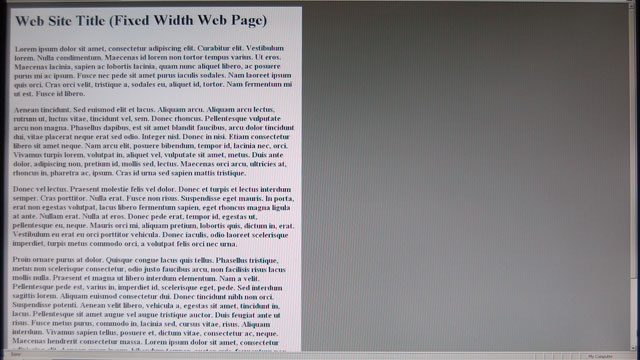
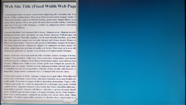
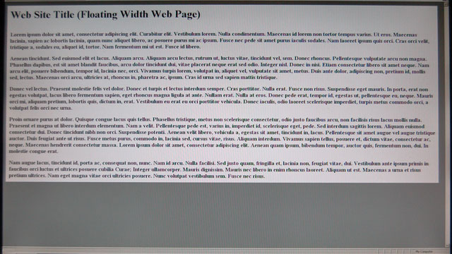
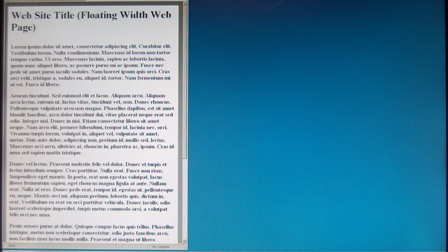
Because screen widths vary, an important part of website design is ensuring that page layout widths are compatible with commonly used monitor resolutions. Page widths may be fixed, or they may be designed to shrink and grow according to the browser window's width. Fixed-width layouts offer precise control over placement of images, text, and other page elements. However, flexible-width layouts are sometimes a good alternative to fixed-width layouts, which will appear surrounded by many pixels of white space on larger, wide-format monitors. The sample web page layouts at right illustrate these distinctions.
In the two fixed-width examples at upper right, the web page displays acceptably in full-screen mode on a wide screen display, but much of the screen real estate is unused. When displayed in a narrow window, however, part of the web page width is not visible. A horizontal scroll bar must be used to view the hidden part of the page.
In the two floating-width examples at lower right, the web page displays acceptably in full-screen mode on a wide screen display, but its long lines of text are difficult to read. When displayed in a narrow window, however, the web page text flows to fit within the available window width, making it readable even on narrow, mobile display screens.
User-Friendly Design
Finally, when designing a website, it's important to maintain the current conventions — particularly those related to links, structure, and navigation — that are being used elsewhere on the web. This ensures that viewers don't have to learn anything new when using the site. While the web is constantly changing and new innovations are always being introduced, it's best to avoid these until they are widely accepted and understood.
Website Design References
There are many good reference guides, both online and in book form, which can help web designers create effective, user-friendly websites. Web Style Guide discusses fundamental principles of web design. Website Design Tips lists a series of well-organized suggestions for designing a website and its pages. For more technical designers, Design Issues for the World Wide Web features in-depth articles and insights about the architectural design of the Web.
Hosted Website Tools
Website design is both an art and a science, and these web design tools can help provide interest and repeat visits to your site. Our free HTMLcolors tool lets you easily test web page color schemes and layouts. EZpolls enables visitors to vote and check poll results in surveys which you design; GuestBook lets visitors enter comments and answer your customized questions; BoardServer lets visitors interact with each other or with a moderator.
Once your web site is active, it is important to monitor its visitors, its links to other sites, and its accessibility. Counter can track the number of page hits or unique visitors to your site, while the SuperStats traffic reporter can answer many more questions concerning your visitors. Finally, WatchDog can monitor your web site's performance and notify you if it becomes inaccessible.
To learn more about individual web site tools, use the links shown above.